
LFW Autumn / Winter 2024
The palette of vibrant and impactful colours showcased in LFW Autumn/Winter 2024/2025 combines retro influences with fresh visions. This collection seamlessly merges wearability with desirability, featuring refined mid-tones, nature-inspired shades, deep darks, and genuine neutrals. These elements reflect a shift in mood, boasting strong trans-seasonal appeal and an inherent sense of elegance and ease. The hues are both sleek and practical, creating reliable essentials that promote a straightforward yet creatively expressive approach to dressing.
Colours for LFW Autumn/Winter 2024/2025 redefine core colours and seasonless tones," stated Leatrice Eiseman, Executive Director of the Pantone Colour Institute. "This thoughtfully crafted palette not only emphasizes functionality but also provides a solid foundation for layering playful accent tones, infusing drama into simplicity, nurturing the senses, and celebrating the 'elevated every day.'"

Pantone's Sunburn, first colour of Autumn/Winter 2024/2025 collection, is a warm, earthy hue with a touch of orange 🤎 reminiscent of terracotta or a sun-kissed landscape. It's a versatile colour that can add a touch of warmth and vibrancy to any outfits. Try to pair with olive green or terracotta for a harmonious colour palette, or also nice with navy or teal to create a striking contrast and highlight sunburn. Amazing with mustard or gold, too. This is a shade all autumns want to wear, especially a soft subgroup.

Pantone's Rain Forest, is a rich, deep green. It embodies the serenity and vibrancy of nature, embodying vitality and growth. To create a clean and fresh look, pair it with crisp white. You can pair with navy or teal to create a striking contrast or with browns to complement the green hue. Winters will look great in this colour. People who belong to Deep Autumn can borrow it, too 💚 There is no Autumn/Winter season without green 💚 I hope you love this green as much as I do

Pantone's Misted yellow is a soft, warm, and dusty shade of yellow. Colour reminiscent of a hazy sunrise or a field of golden wheat. You can pair this colour with any colour from the autumn palette, but olive green will create a harmonious and natural palette. Soft coral or peach tones will add a vibrant and cheerful touch to your outfits. Autumns need this colour to their wardrobe, especially the soft subgroup.
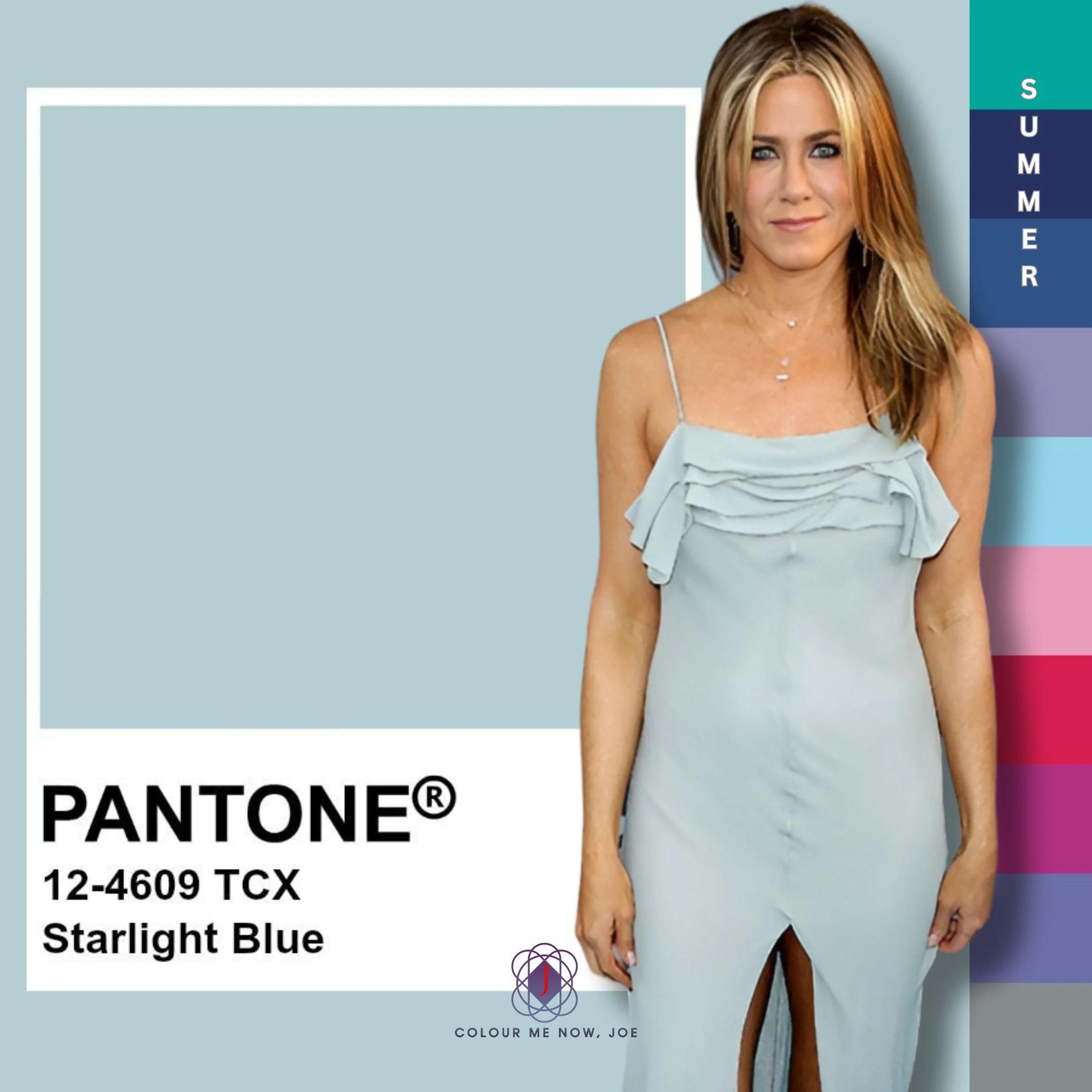
Starlight Blue is a light, dusty shade of cyan, reminiscent of clear sky or a gentle sea. It's a sophisticated and elegant colour. Try to pair with grey or mint for calming look or silver accessories. Very nice with nude pink, too. This colour is calling for all summers, especially for soft subgroup 💙
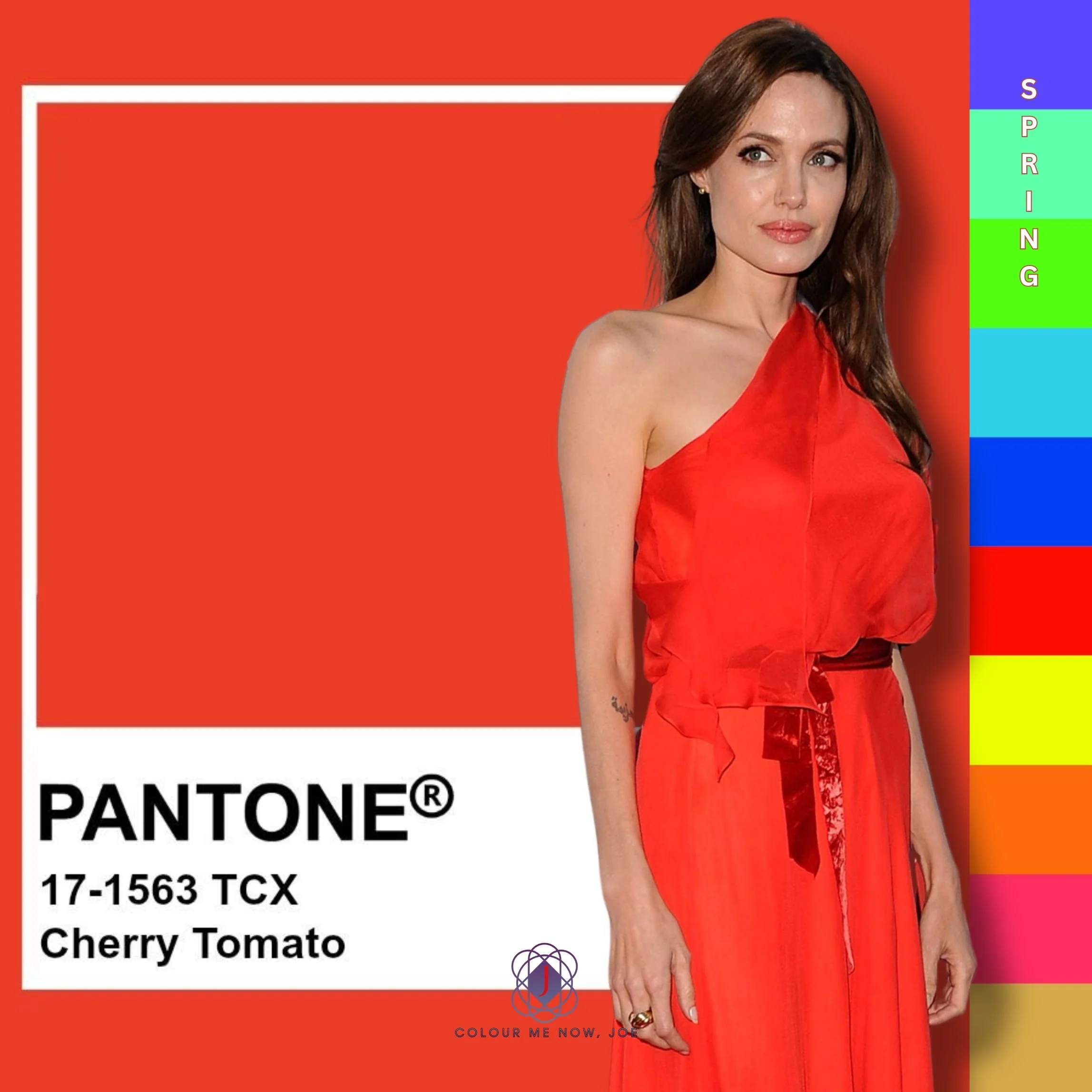
Cherry tomato is a vibrant, energetic shade of red with strong orange undertones. It's a striking colour that can add a lively and dynamic touch to various looks. You can wear it on its own and pair it with gold or pair it with teal or turquoise. Yellow or bright pink will create a lively and energetic palette. This vivid and sunny colour is for all types with bright and light characteristics like Angelina Jolie, Sara Sampaio, etc.

What would autumn 🍂 be if #pantone didn't indulge in a little orange in it. Pureed pumpkin is a warm, rich shade of red-orange. 🧡 This colour evokes a sense of warmth and cosiness, reminiscent of autumn leaves or a freshly baked pumpkin pie. I love this colour to be paired with olive green, mustard yellow, or dark teal. All autumns, but especially warm subgroup types, will look gorgeous in this hue.
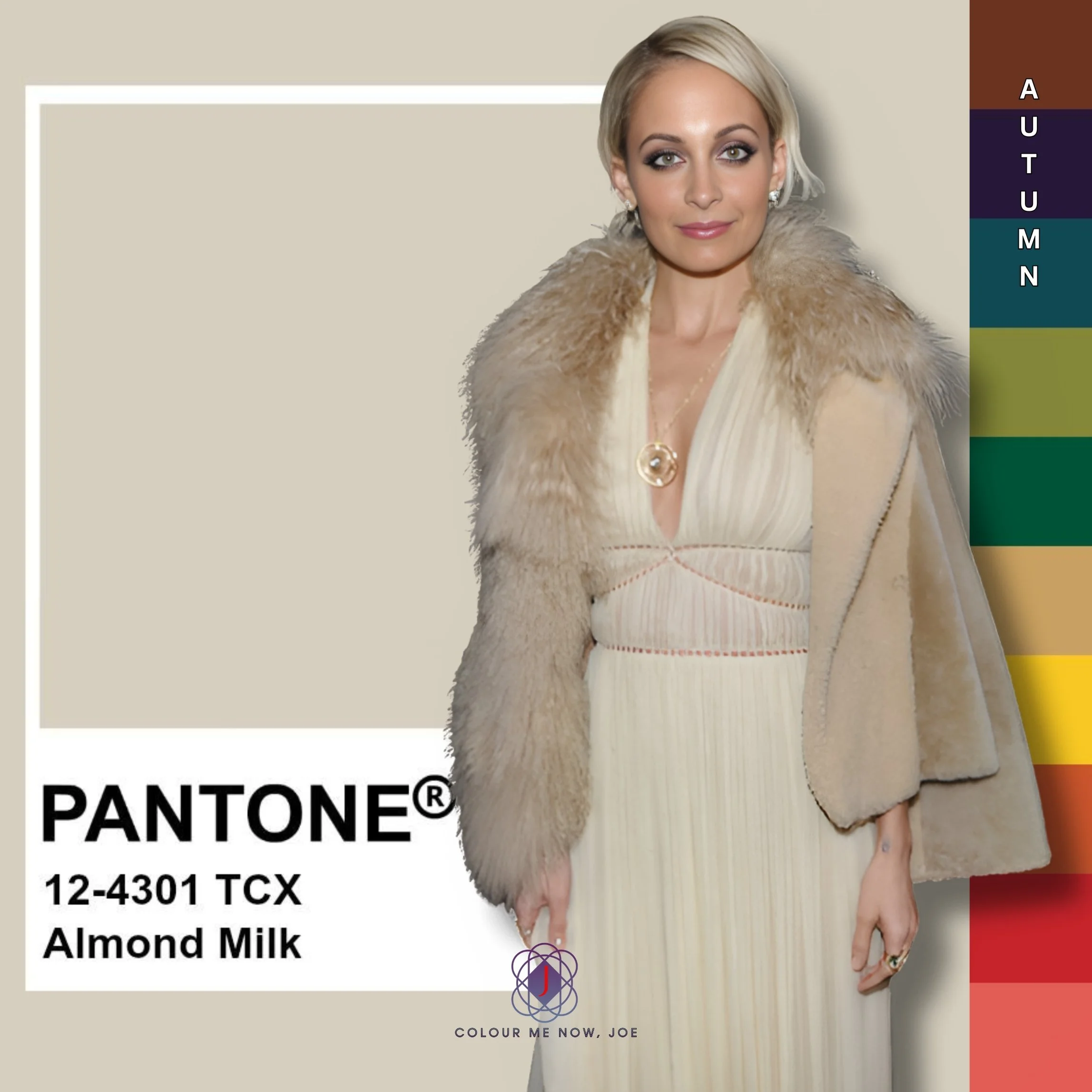
Pantone's Almond Milk is a warm, creamy, off-white shade with subtle beige undertones, evoking a sense of softness and warmth. Almond Milk pairs beautifully with rich earth tones like terracotta and olive green, as well as pastel shades like blush pink and soft lavender. For a more modern look, try pairing it with deep navy, and don't forget to add some copper accessories. It is a great neutral for soft autumns and soft summers
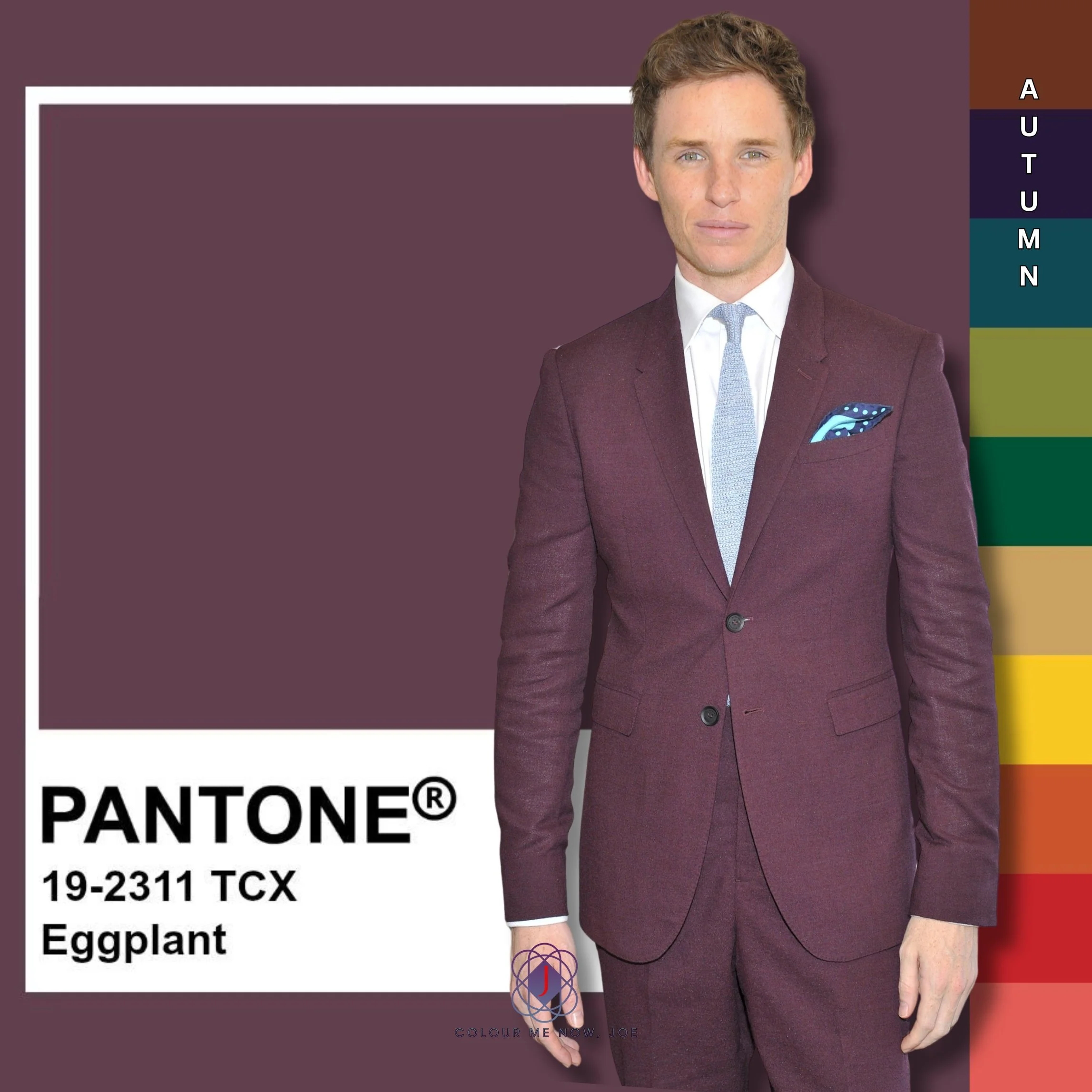
Pantone's Eggplant is a deep, rich purple that evokes a sense of sophistication and luxury, reminiscent of the dark, velvety skin of an eggplant. Wear it with gold to add more luxury or nice with soft pinks and olive green. Nice in makeup too, especially eye-shadow, lipstick or nail polish Colour for all autumns, especially warm subgroup
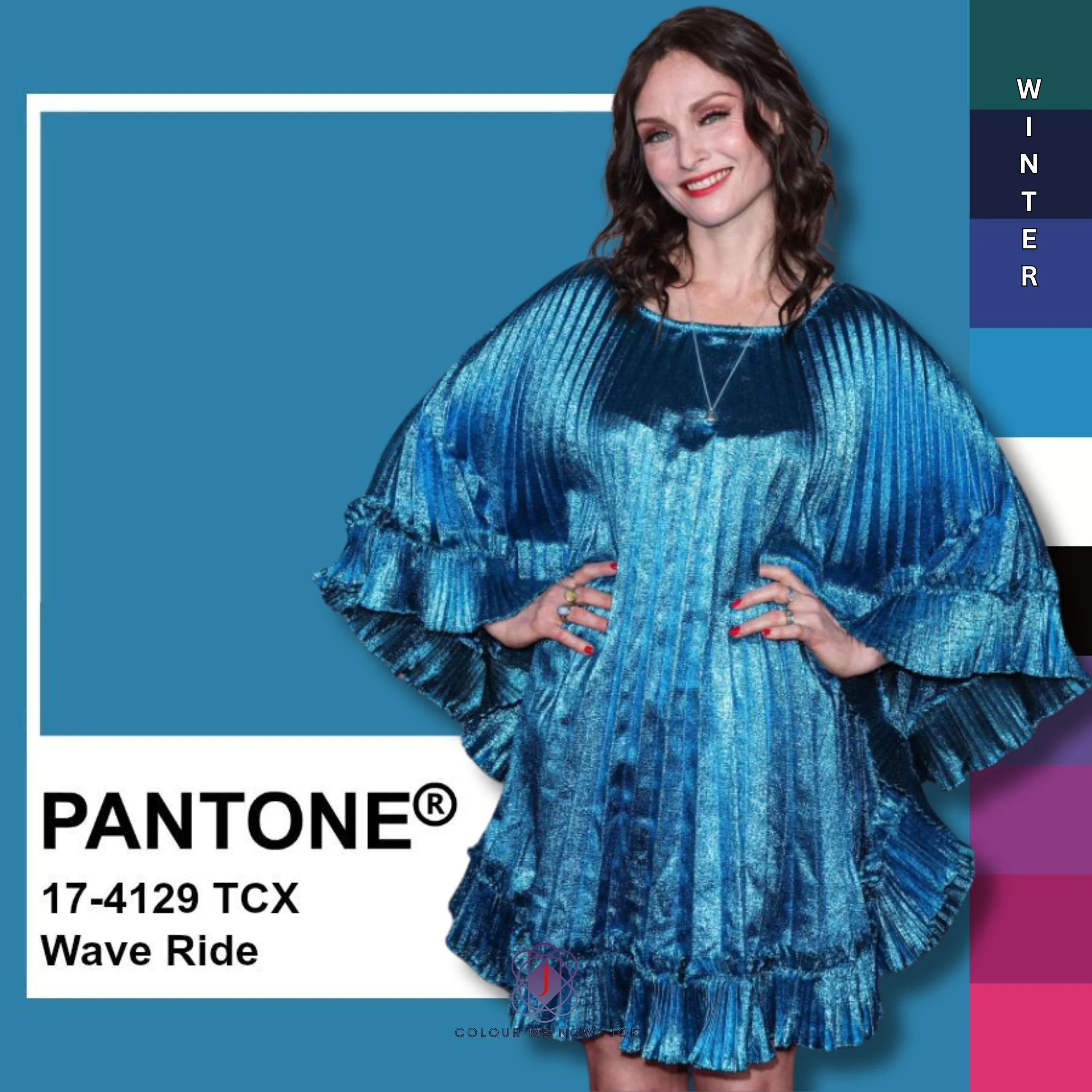
Wave ride is a vibrant shade of cyan. It's a versatile colour that can add a lively and dynamic touch to your outfits. 💙 It looks striking alongside coral, soft peach, and sunny yellow for a lively combination. Light, pastel greens like mint can create a refreshing and calming look. Amazing with Magenta and Black - you should try. Bright winters can wear this colour well

Pantone's Storm Front 🩶 is a cool, muted grey with hints of blue. It's a versatile and neutral colour that can add a touch of sophistication and subtlety to your outfits. For a dramatic contrast, consider combining it with deep navy or charcoal grey. Soft pastels such as blush or mint green can add a refreshing touch, while bright accents in colours like mustard yellow or vibrant coral can create a striking, modern look. Summers, this is one of your best neutrals 🩶

Pantone's Sheepskin is a warm, creamy beige that exudes a soft and inviting feel. This versatile neutral can be easily paired with a range of colours, including earthy tones like terracotta and olive green for a natural look. For a more sophisticated look, it works beautifully with deep jewel tones such as emerald or navy. Additionally, combining Sheepskin with soft pastels like blush or lavender can create a serene, calming palette, making it an ideal choice for both contemporary and classic looks. Perfect neutral for both, Autumns and Springs (for cold months).
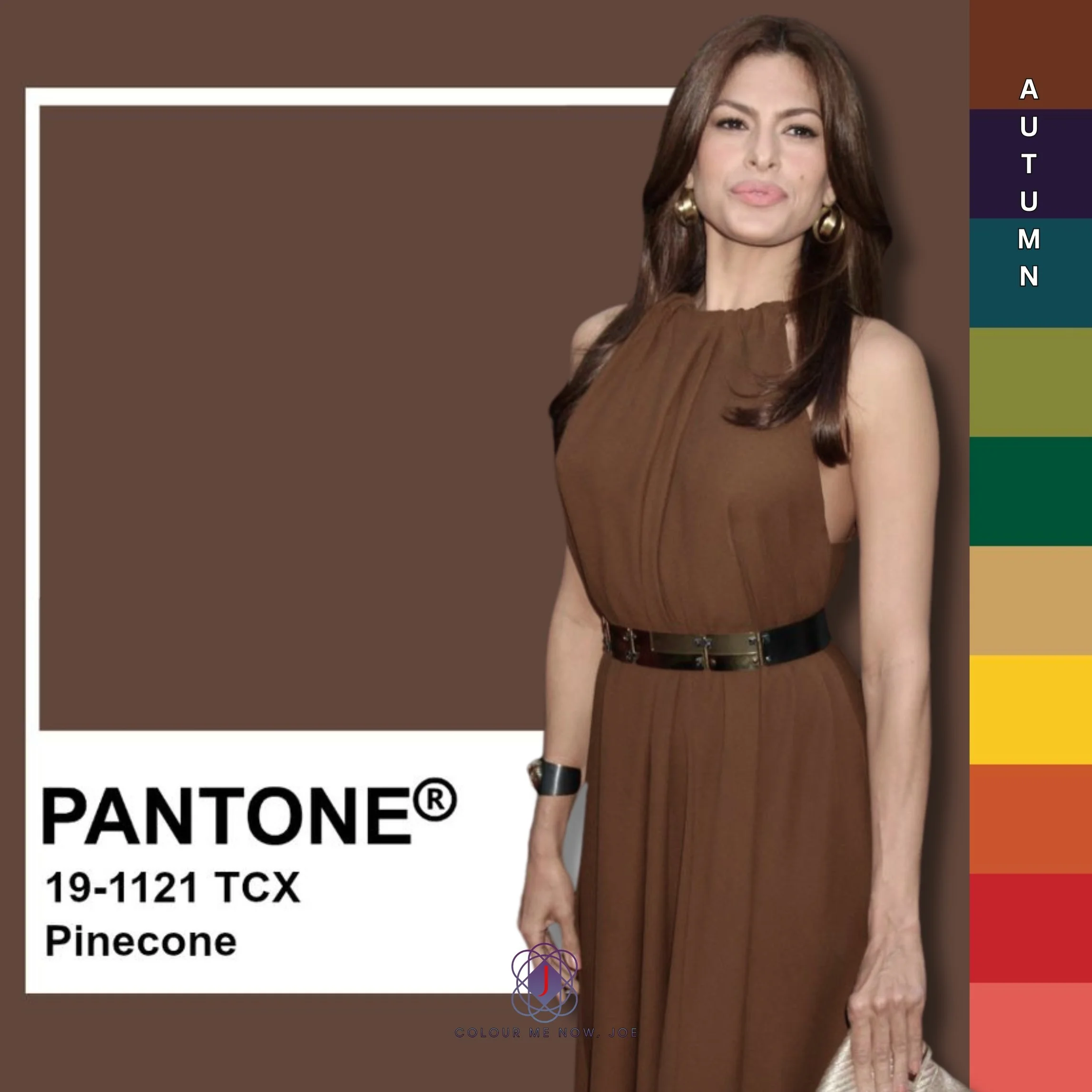
Pinecone is a rich, warm brown that evokes a sense of earthiness and comfort. It pairs beautifully with muted greens and soft beiges, creating a harmonious palette reminiscent of the outdoors. Additionally, accenting Pinecone with warm metallics, such as gold or bronze, can elevate its warmth and richness, making it ideal for both rustic and modern designs. This brown is for people who belong to the autumn 🍂 🥮 season.
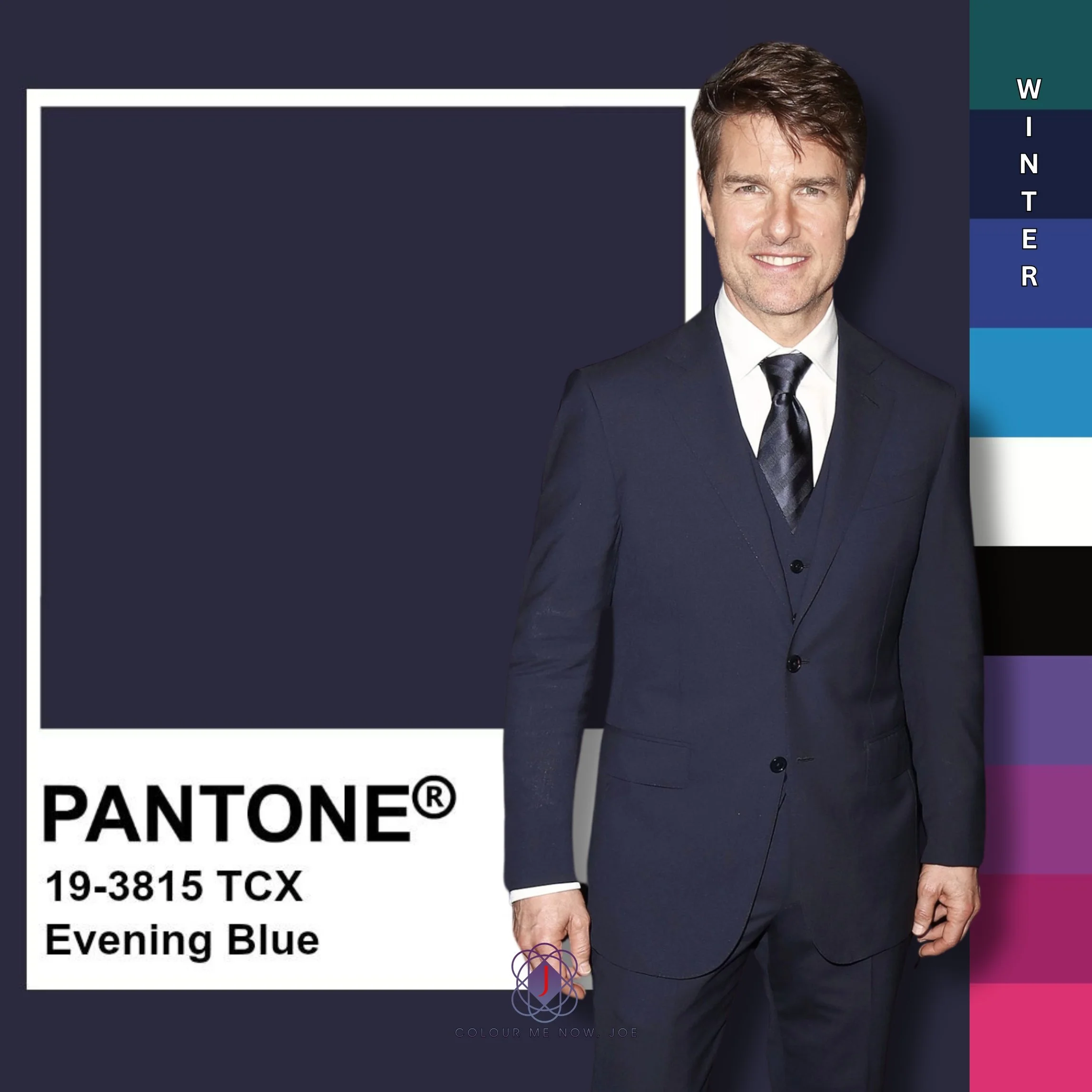
Evening Blue 💙 is a deep, sophisticated navy that conveys elegance and tranquillity. This versatile shade works well as a backdrop for various colour combinations, complementing lighter tones such as crisp whites and soft greys for a classic look. It can also be paired with bold colours like burgundy or mustard for a striking contrast, adding drama and richness to the palette. Evening Blue is particularly effective in both formal and casual settings, making it a popular choice for fashion. Perfect for Winters, but also, cool summers could use this colour instead of black, preferably during cold months.
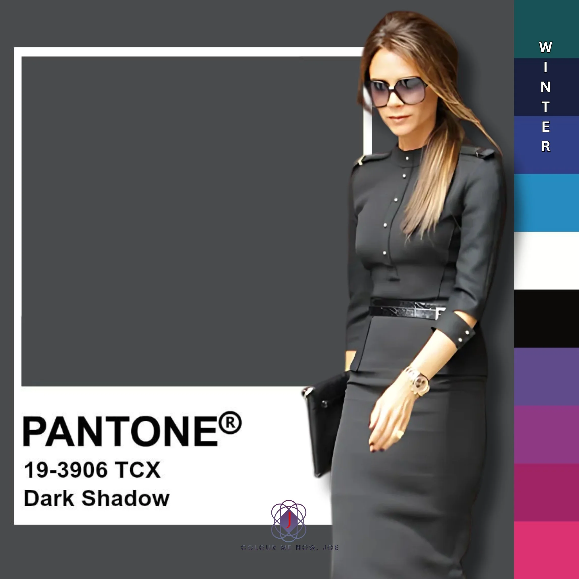
Pantone's Dark Shadows is a deep, moody grey that exudes a sense of sophistication and mystery. This versatile shade can serve as a neutral backdrop, allowing brighter colours to pop, or it can be used to create a dramatic monochromatic look when paired with other dark tones. People with cool undertone can wear this neutral
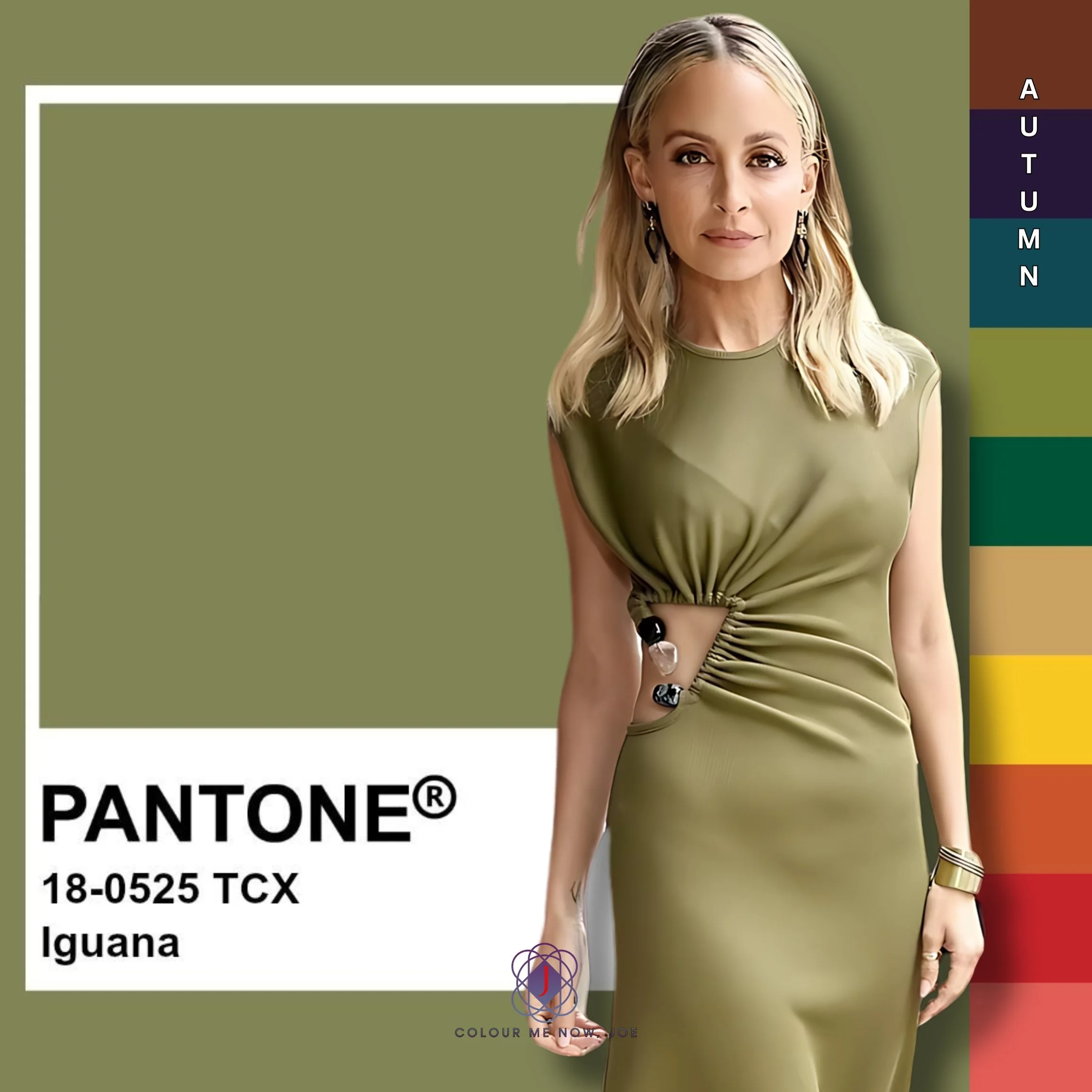
Pantone's Iguana is a vibrant, earthy green that evokes a sense of nature. Can be paired with neutrals such as beige, cream and light warm grey or other earthy tones, like browns, tans, camel or golden yellow. Autumns will take advantage of this neutral